Graph visualizations don’t receive serious treatment as compared to other graphical representations of data like line charts, bar charts, and box plots. Edward Tufte’s classic book The Visual Display of Quantitative Information contains 0, yes 0, graph visualizations. That is a shame because graphs can be just as useful when applied correctly.
What is a Graph?
A graph, G, is a structure that consists of nodes, N, and edges, E, and can be constructed by $$G_0=G(N,E).$$
The nodes of a graph contains attributes about the entity represented. And edges are used to connect nodes in a graph. Edges go in one direction or both directions between nodes and can represent different connections between entities. Is_Related would be a bidirectional connection Facebook graph of profile pages but Is_Parent would be unidirectional.
Why care? Famously, Google used Page Rank to efficiently and accurately rank websites on the web with computers, beating out human curated lists from sources like Ask Jeeves. And they were able to do this because of convergence properties of graphs. Besides the web, graphs represent the most fundamental structure of reality and allow for complex physics theories like explaining quantum entanglement (“spooky action at a distance” as Einstein would say). The only issue is that they can be complex to analyze.
Examples of Graph Visualizations: The Good, the bad, the ugly
Now that we’ve gotten the formal definitions out of the way let’s look at some graph visualization examples.
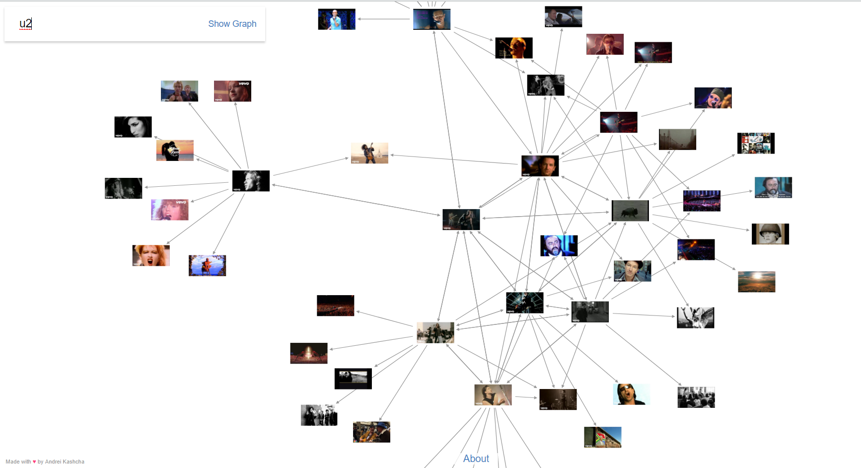
Those 2 examples come from Andrei Kashcha, a passionate visualization practitioner. Give him a follow on Twitter to keep track of all the work he’s up to.
Another example a graph you may have seen before is a family tree. An easy way to track lineage of families. As the name implies, family trees are a special case of graphs known as “trees”.
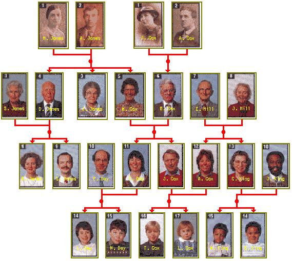
Imagine having to read this data without a visualization and trying to answer how many siblings “D. Jones” has and if those siblings are married. Here try it. It’s just like one of those annoying SAT or IQ questions.
| Name | Relation to | Relative |
| D. Jones | Husband | S. Jones |
| D. Jones | Son | A. Jones |
| D. Jones | Son | H. Jones |
| D. Jones | Brother | J. Jones |
| D. Jones | Brother | M. Cox |
| D. Jones | Father | S. Jones |
| D. Jones | Father | R. Jones |
| J. Jones | Daughter | A. Jones |
| J. Jones | Sister | D. Jones |
| M. Cox | Sister | D. Jones |
| J. Jones | Sister | M. Cox |
| M. Cox | Sister | J. Jones |
| M. Cox | Wife | B. Cox |
| M. Cox | Daughter | A. Jones |
| M. Cox | Mother | T. Day |
| M. Cox | Mother | J. Cox |
| M. Cox | Daughter | H. Jones |
| J. Jones | Daughter | H. Jones |
Not fun to work through at all. And the chart only shows information for 3 family members! (The answer is 2 siblings and 1 of those siblings are married).
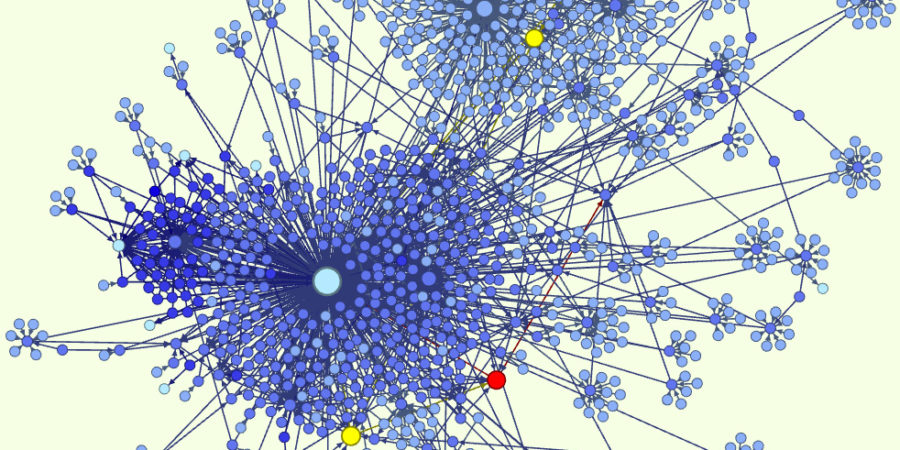
The Bad and the Ugly
The ugliest of graphs look the prettiest. But the issue is that they have so much going on that it’s hard to make any insights from them. Like this graph of “related” philosophers.
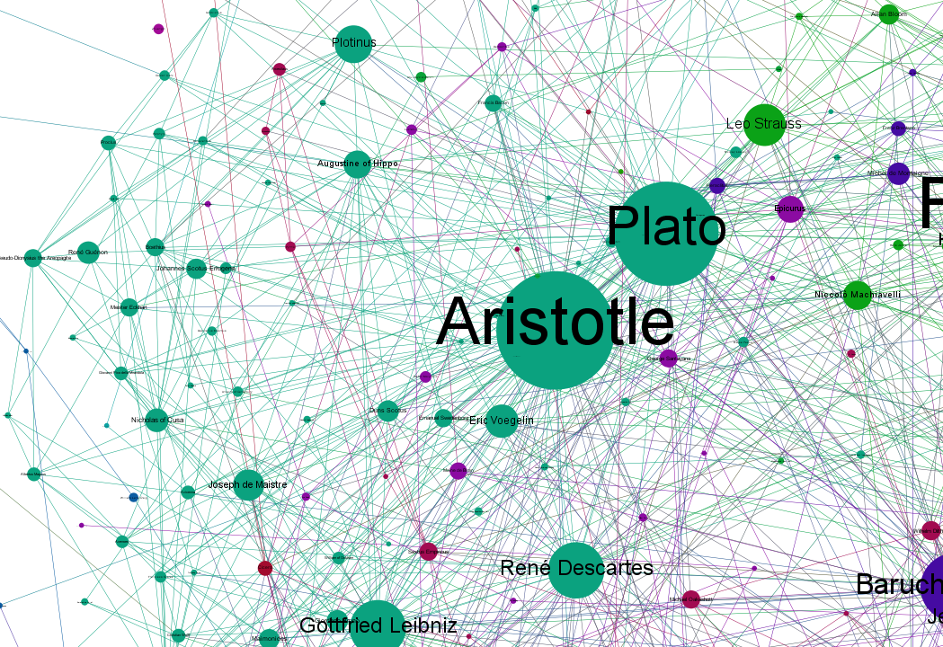
This graph shows importance of philosophers with a small link denoting any other philosophers that influenced them. A table format showing importances would do roughly the same, while also allowing your eye to make the comparison between Leibniz and Descartes without optical illusions making them seem impossibly the same. A much better way to look at this data would be to organize it hierarchically to show the evolution of influences over time because Descartes couldn’t possibly influence Aristotle because Descartes was born after Aristotle lived. Making the graph interactive by hiding all the content until the user is ready to explore would make the graph much more appealing.
My critique is a bit harsh considering graphs are really tough to make. Still, we shouldn’t try and fluff up bad visualizations. Another bad one,
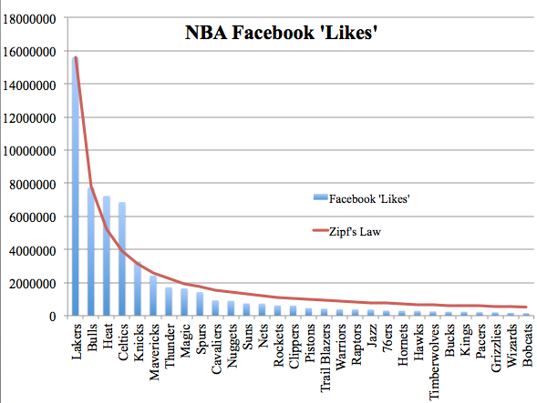
The graph looks like something but what are we supposed to make of it. Some nodes have few edges while others have many? A quick plot of the data showing the phenomenon called Zipf’s-Law would do a better job of showing that.
What makes a Graph Visualization Good?
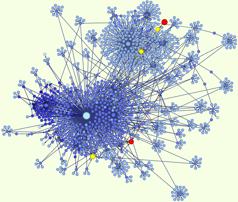
Graph visualizations should show something more easily than another visualization. Most of the time this means graphs have to be interactive or very simple like the case of the family tree. Andrei’s Youtube graph works much better than the philosopher’s graph because his is interactive. Providing you an interface that allows you to explore the numerous connections and relations while inviting you to keep searching.
As practitioners, we have to do a good job utilizing graphs by using them as appropriate. Commonly, graphs are most useful in the exploratory phase of data analysis to show correlations. Some good examples for using graph visualizations are:
- Understanding investment firm influence by visualizing board member affiliations
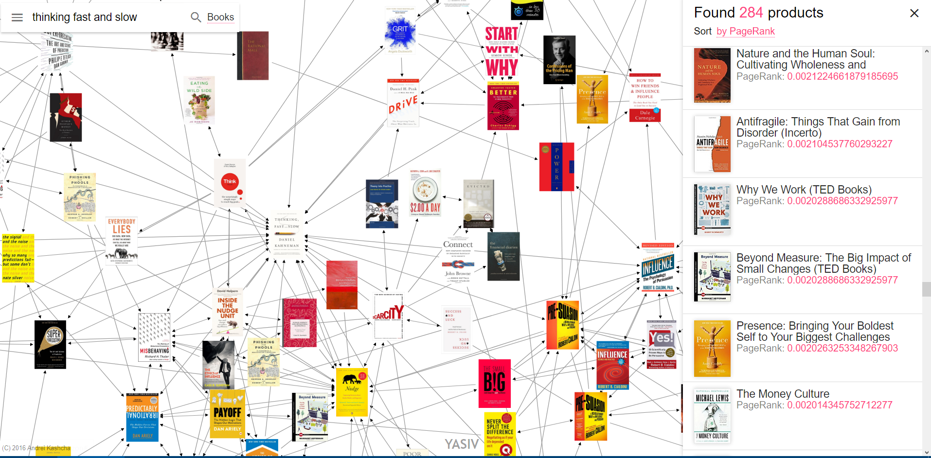
- Showing progression of thought — Jonathan Bales is a famous daily fantasy sports player that cites George Soros, Nassim Taleb, and Daniel Kahneman. Realizing that George Soros’s thesis adviser was Karl Popper, Nassim Taleb cites Karl Popper extensively means Mr. Popper is an important guy. Nassim Taleb also cites Daniel Kahneman. Another famous author Malcolm Gladwell cites Daniel Kahneman in his book The Undoing Project. Understanding all this would help the reader realize the importance of Karl Popper and Daniel Kahneman if they want to be better at Daily Fantasy Football (and the whole science of reasoning with incomplete information). Also, Jonathan Bales and George Soros were philosophy students — not a bad major after all if you want to be filthy rich or dead poor #barbell
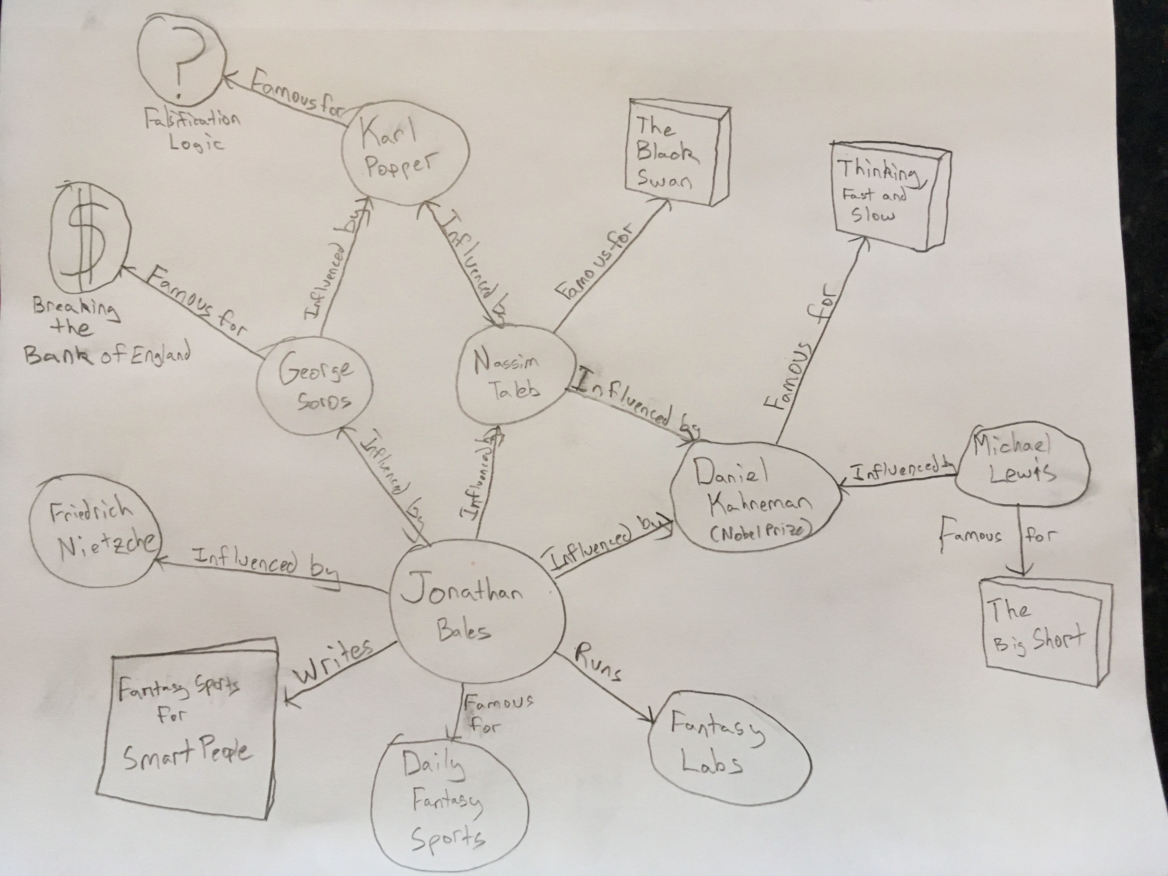 UPDATE: I tweeted that picture to Jonathan Bales and here’s what he said
More Nietzsche and Taleb than Soros, but yes, this is accurate (and cool)
— Jonathan Bales (@BalesFootball) July 6, 2017
Follow me on twitter if you haven’t already.
Other examples where graph visualizations would work well:
- Finding antagonizing views. With Jonathan Bales, we just traced his influences but there is probably a camp of thinkers that hates his barbell approach to daily fantasy sports. And they’d be identifiable through graph analysis of antagonizing citations — antagonizing like when I linked to those graph visualizations I thought were bad.
- Looking for movies based on cliques of directors/cast members. Like you want to find all movies with Adam Sandler’s posse of co-stars or you never, ever want to see them.
- Promoting exploration of a dataset in unfamiliar domains
- Identifying powerful influencers and tracking the usefulness from a share from a member a social graph. PSA: PLEASE SHARE MY CONTENT. For every share I’m averaging 20 new users and the more I get, the more I can keep churning out content like this 🙂
When and Why should you Use a Graph Visualization?
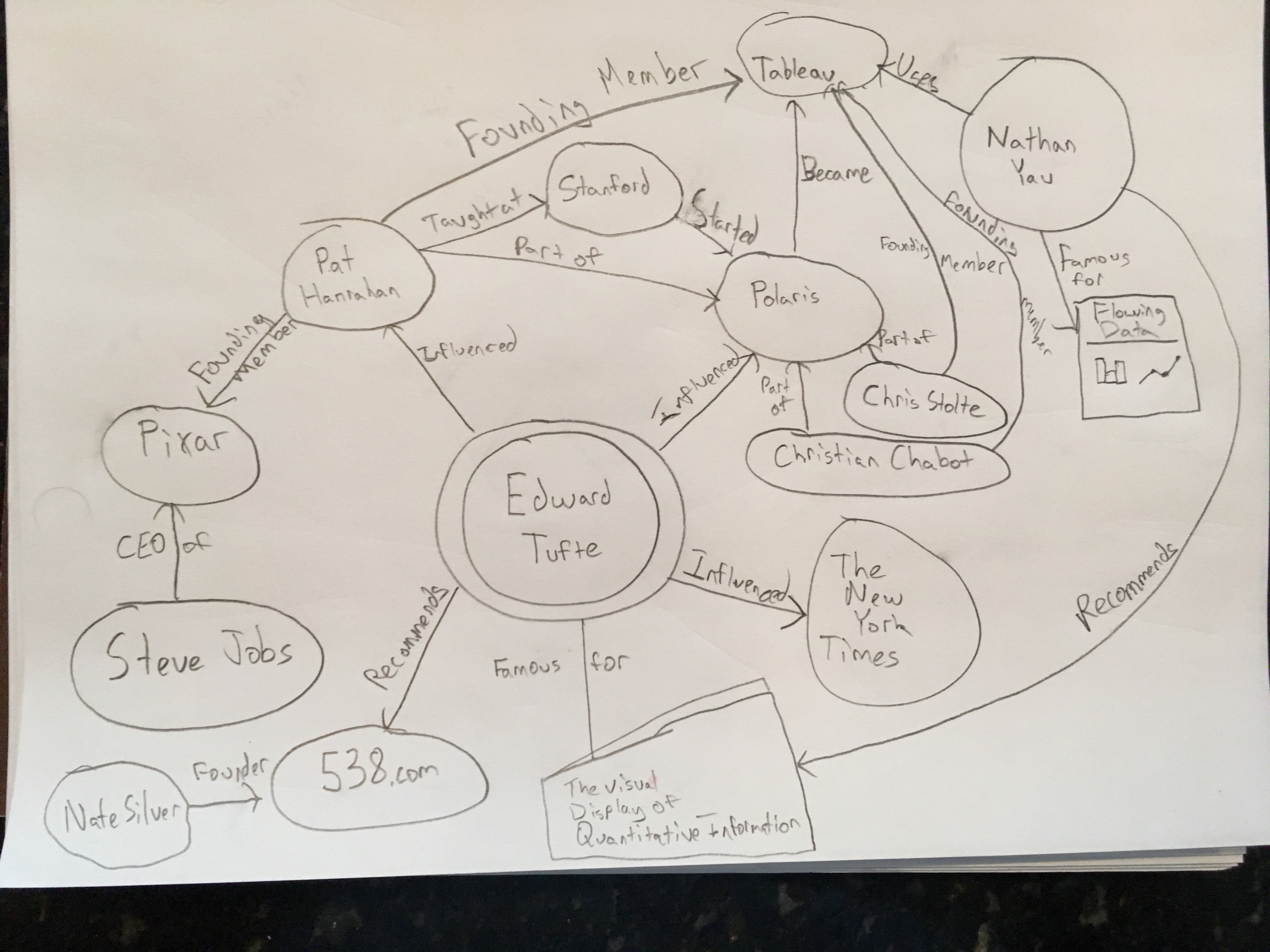
As you can see, finding cliques and subgroups is an important applications where graphs work. In the context of Tufte’s visualization formalism a graph should be used to show categorical relations between categorical entities to show potential correlation effects. Tufte’s formalism is the same that Tableau, which was started as Polaris by a Stanford research group in the 2000’s, and the research group Nathan Yau of the popular blog Flowing Data has a link from. Nathan also recommends you buy Tufte’s book! See. We just used an explanation of connections that shows the importance of Edward Tufte. This calls for a graph!
Graphs have a long way to go but will increasingly become more and more important as technology and interactivity improves. If you have a graph visualization you want added to the list leave a comment or ask me to investigate a dataset.
More Information
- To learn more about Edward Tufte and his formalism, I highly recommend his book The Visual Display of Quantitative Information — a classic from the 1970’s.
- To get started with Nietzsche I would recommend Walter Kaufmann’s translation, The Portable Nietzsche — mine was used signed by a serial killer in Iowa so that was interesting.
- Buy Jonathan Bales fantasy sports books or check out his website.
- Read Nassim Taleb’s approach to reasoning with incomplete information The Black Swan.
- Check out Nathan Yau’s blog Flowing Data.
- Learn about the cognitive psychology hacks with Thinking, Fast and Slow. The same hacks that Jonathan Bales loves to exploit when he creates lineups and when he pricing his books on Amazon. ONLY $5.97 at time of posting. Seriously this is a great buy.
- Follow Nate Silver’s blog FiveThirtyEight