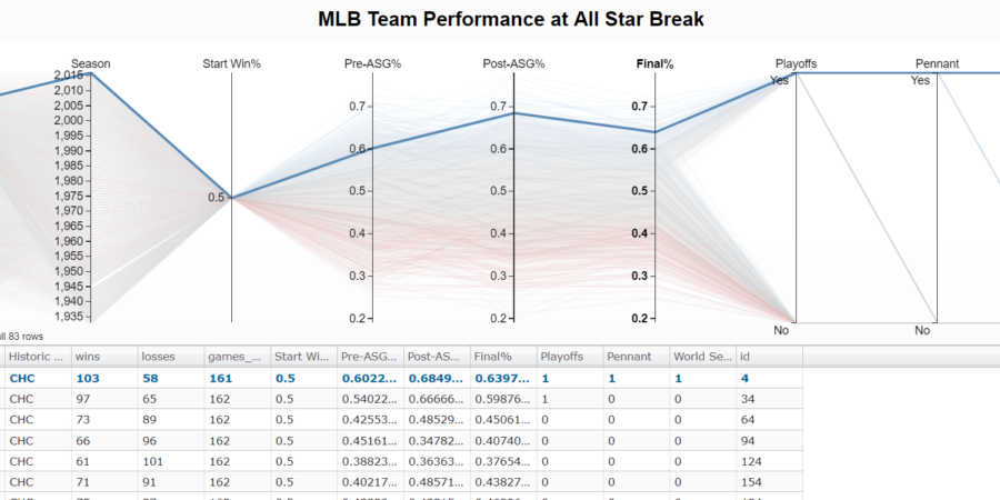
With the all star break upon us, I wanted to see how team records at the all star break compare to full season performance. The Chicago Cubs sit below .500 with a 43-45 record (.489) and as a White Sox Fan I get giddy at the prospect of them not doing well again. Last season was tough.
Using The Visualization to Understand the Cub’s Chances
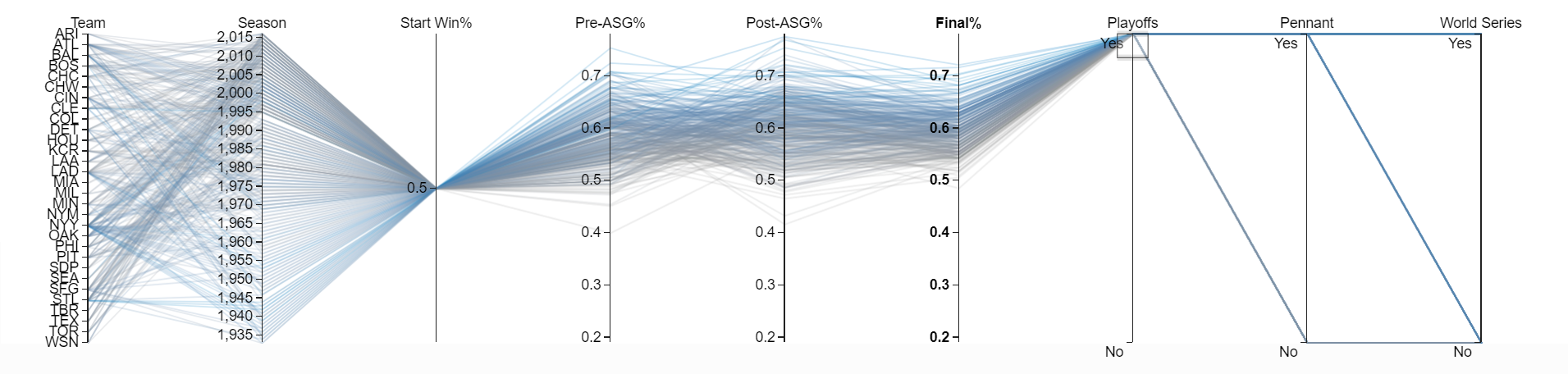
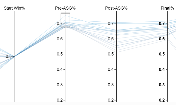
I spent a lot of time deciding between visualizations and opted for a parallel coordinates plot. Essentially a parallel coordinates plot is just a line chart with a few bells and whistles. The cool part is that you can dynamically filter the chart on every variable displayed. To see the worst team that made the playoffs, you can highlight “Yes” on the “Playoffs” column.
On the chart, there is a team with a .400 record at the all star break (“Pre-ASG%”) that made the playoffs. Just highlight that record and the table below will update with all the team’s season information.
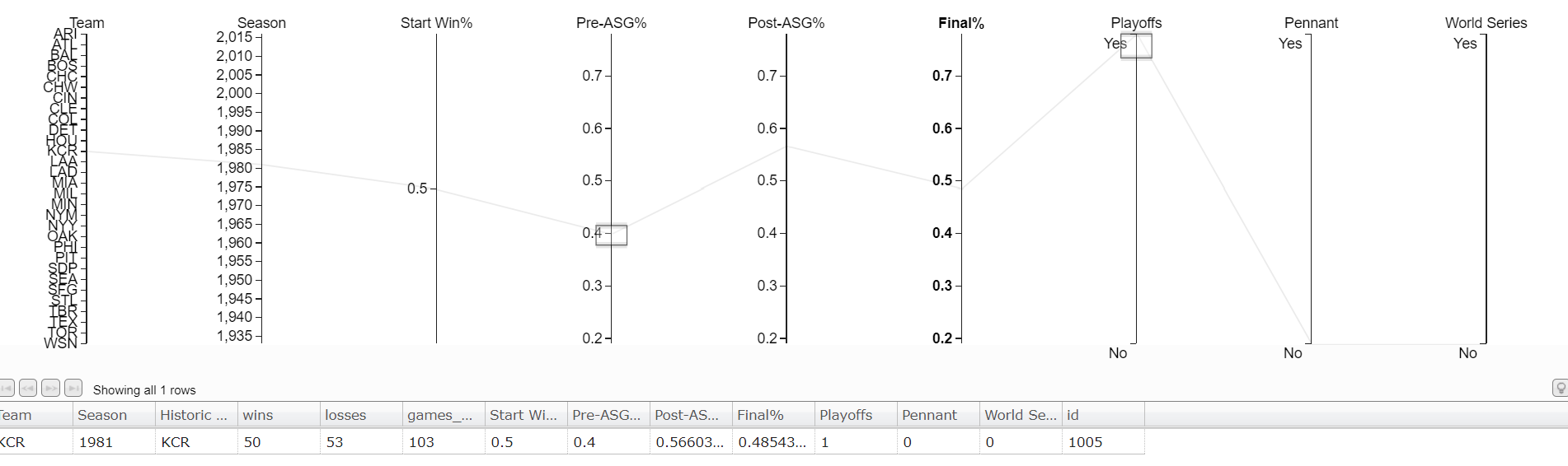
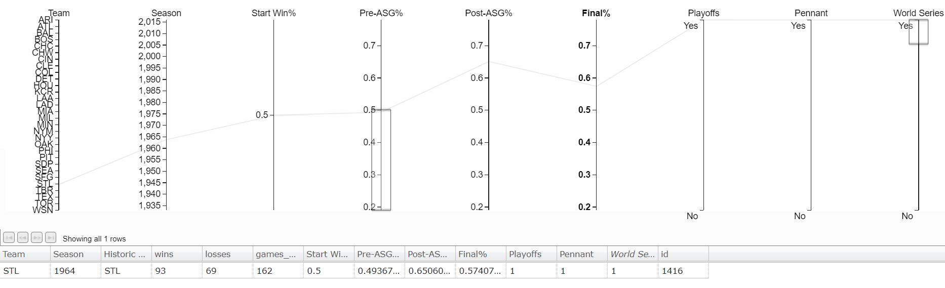
It’s the Kansas City Royals, and they made the playoffs with a .400 record at the all star break.[1]1981 was a strike shortened season resulting in fewer games. The Cubs have hope to make the playoffs but winning the World Series again will be tough. Only 1 team has won the World Series with a losing record at the All-Star Break. The St. Louis Cardinals in 1964 won the World Series with a .493 record at the break.
Conclusion: The Cubs Won’t Repeat
I’m pretty confident the Cubs will not win the World Series this year thanks to my data. To view the visualizations for yourself and make your own conclusions about the MLB head over to my visualization server. The live version used in creating this post is running there. Special thanks to d3.js and the people behind d3.paracoords.js for providing great tutorials to start with.
As always, I’ve published the code and dataset on my github. If you’re interested in getting access to all my MLB or other sports data please go to Sports Data Direct and signup to be notified when they launch. At Ergo Sum, we are testing the data behind Sports Data Direct before they launch to the general public.[2]The author of this post is also the founder of Sports Data Direct.
Some Thoughts on Parallel Coordinate Visualizations
Most of the time I see parallel coordinate plots used is with numerical multi-dimensional data like the example I built today’s visualization from. Parallel coordinates are great for showing multi-dimensional data but there is also the bonus of ordering the axes informatively. Placing tightly coupled axes next to each other is more informative than requiring the user to use filters to extract that same information. For example, in this first picture we order the axes 1,2,3,4 and see what looks to be equal and opposite correlation effects between the axes based on some distance from a central point.

Rearranging the axes, shows that axis 1 and 4 are actually the same! And the the distance from center correlation affects are still there.

Although this was a simple example, I think it is important for the ordering of axes to not be arbitrary and follow some process based on the information gain a viewer should see in a parallel coordinates plot.
Time Is Naturally an Ordered Dimension
Naturally, time is a dimension that always increases and expresses the change from a prior state to a future state.[3]at least in most physical models Because of this, parallel coordinates are great to show self-correlation(auto-correlation) of a time signal with different time lags. Say you have monthly purchasing volume and find November is a busy month because of Black Friday. Placing the purchase volume a year apart and next to each other in a parallel coordinates plot would allow you to see the yearly growth at each “lag vector” (list of prior prices). Quickly, you’d see the growth rate as it changes across different months.
The first time I saw a parallel coordinate plot, I was reading Non-Linear Problems in Random Theory by Norbert Wiener. If you don’t know who he is that’s OK. He’s famous for building on the theory of Brownian motion and random walks. [4]A random walk is just signal that has very small auto-correlation, like the number of times a fair coin has come up heads. The fact that a fair coin has come up heads 10 times in a row should have no … Continue reading In Norbert’s book, he derives properties of the more complicated Wiener process by using parallel coordinates! And yes some guy actually is famous for deriving a Wiener process from Brownian motion — pretty funny, if only he could turn water into gold.
Future Work
As a follow up, it would be interesting to see mean reversion to team strength in the MLB. In this article we used win percentage as a signal of team strength and found some small mean-reversion effects like teams off to a hot start.
If you could predict the rating of a team, like in the Elo algorithm or by using Pythagorean Win-Loss, it should be possible to show mean reversion effects in the parallel coordinates plot while also using the information to predict final season records.
References
| ↑1 | 1981 was a strike shortened season resulting in fewer games. |
|---|---|
| ↑2 | The author of this post is also the founder of Sports Data Direct. |
| ↑3 | at least in most physical models |
| ↑4 | A random walk is just signal that has very small auto-correlation, like the number of times a fair coin has come up heads. The fact that a fair coin has come up heads 10 times in a row should have no effect on the next toss. |