I’m starting a new posting series called “Visualization Vednesday” where I’ll talk about or create a visualization and critique it. For this first post, let’s talk about Google Maps and travel times.
Travel Times Problem
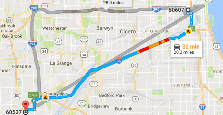
Yesterday I had to drive home from my parents house to go to dinner with my grandma who had just flown in. Traffic can be pretty bad sometimes so I checked Google Maps for the best time to go. 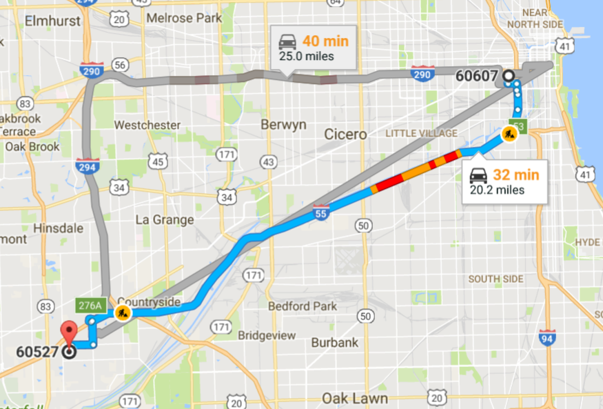
I was planning on driving and my usual route is to take “55”. Google Maps has this nice feature where you can look at traffic at different times to get an estimate on travel time but it’s a kinda clunky interface. You are only allowed to pick between 3 options: leave now, depart at, and arrive by. This is great for telling you when you’re going to get somewhere but it’s a huge pain if you’re trying to minimize your time driving.
I wanted Google Maps to tell me the quickest time to get home between 9AM and dinner time 6PM. But the only way I could do this is by clicking through all the “Depart at” times and checking the estimate.


This was pretty frustrating so I wanted to create a quick visualization that solves this.
Simple Solution: Travel Times with Fixed Route
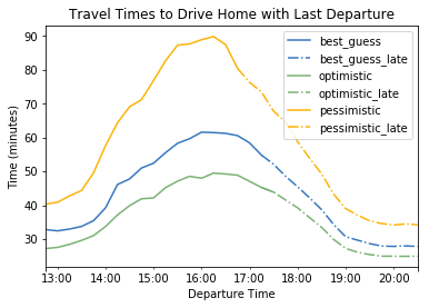
Helping somebody find the quickest travel time is a “solved” problem in data visualization. Common ways to handle this are by displaying the quickest time and a chart showing all the different times. Using the Google Maps Distance Matrix API, I was able to get the data I needed for this visualization and create a chart with matplotlib.
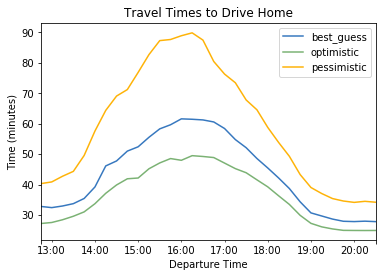
From the chart, we can see that it’s best for me to leave by 1:30 PM and traffic peaks at 4PM.
Critiquing the Visualization
Clearly this is better than clicking that next button on Google Maps but it’s still not that great.
- What if you wanted to know the latest time you could leave?
- And what if you wanted to see it for each of the different traffic models?
Off the top of my head I can think of 2 way to handle these cases. We can “stop” the line at the latest possible time indicating a cutoff point.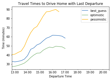 But now we are wasting a lot of ink with that white space. A common technique to handle this is to change the style of the line rather than just remove it.
We’re starting to get somewhere with this. Still I think the boundary for latest time needs to be clearer. A vertical line would help make that boundary clearer.
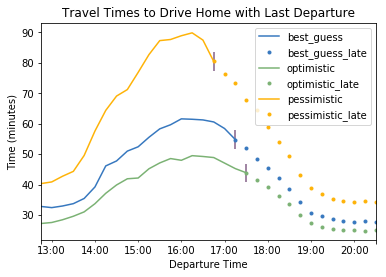
Now our chart has the additional dimension of “latest time to leave” marked clearly. This is far superior to leaving large whitespace in the middle of your chart. Another idea for improvements would be to make this interactive with hovers and inputs for the route information with time constraints. (start_time, arrival time, starting address, ending address).
Closing Thoughts: Even the Simple Case is Hard
Although we were just trying to answer the question, when is the best time to leave to travel somewhere, things can get complicated fast. We assumed the route was fixed — only one good way to go and one mode of travel — there were pros and cons in everything we did. Imagine we had to extend this chart to handle multiple routes — maybe a user prefers trains over driving when there is a big concert but only if the train is no less than x minutes slower. How could you show that intuitively. We’ll try and talk about that next week.
Google can’t always solve for every use case because that could make their UI cluttered. Google Maps is great for showing users the best way to get somewhere at a specific time. For anything else, look to developers to create new webapps using Google’s API.
If you’re interested in the code (how to make these charts and API calls) get the Jupyter notebook on my github.
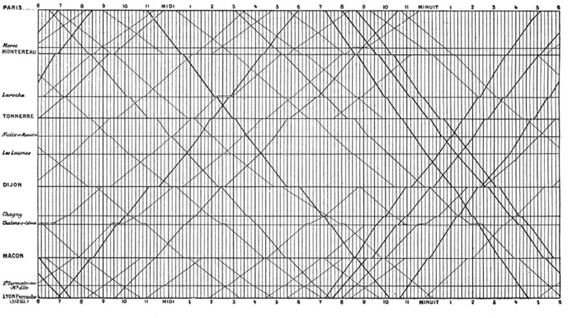
Next week I’ll walk through a famous visualization by E.J. Marey and see what we can apply to our travel times visualization.
UPDATE: I made an interactive version here
[…] to use? Then so many people could create great things based on maps. My old project that helped you decide the best time to drive when your plans are somewhat flexible is not commercially viable with the 2 leading map creators terms of service, Google Maps or […]