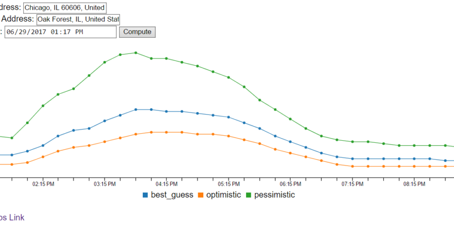
Last week, I wrote about using the Google Maps API to visualize travel times according to when you want to leave by using their “Depart at” feature to simulate traffic. This week I took it a step further and made an interactive version.
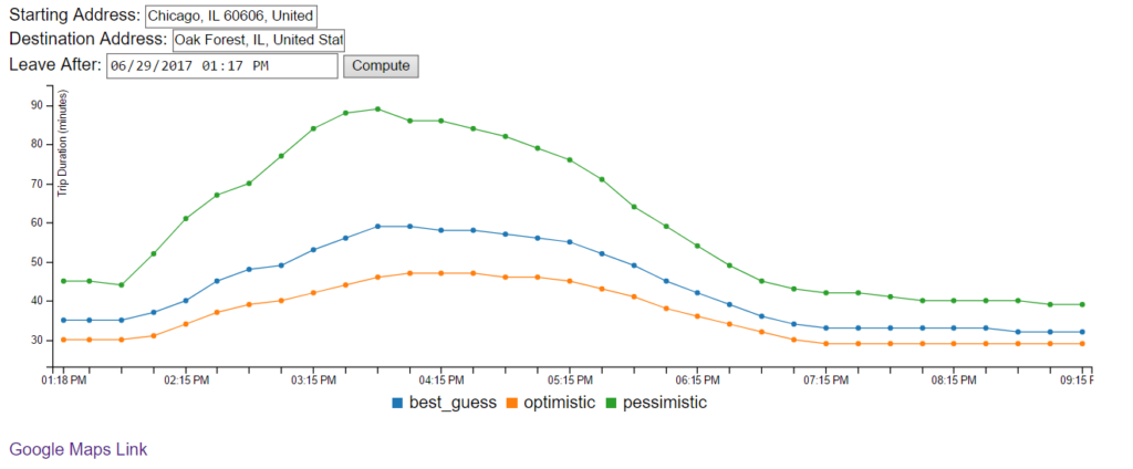 Go give it a try next time you have to drive somewhere, especially for the Fourth of July. And let me know your feedback below in the comments section. The code for this example is available here.
Technologies Used for Travel Times
For the front-end visualization, I evaluated Rickshaw, C3.js, D3.js, Plotly.js, and Google Charts. I ended up choosing C3.js because their timeseries module looked the best. The tooltips were very responsive compared to the buggy experiences I’ve had with plain D3.js and their website gave me a great interactive way to prototype. The look and feel of the other charting libraries just felt off.
I used Python and Flask for the back-end because I like being able to interactively prototype and create the webserver within one language. I’ve worked on numerous python webserver’s and prefer Flask to Django when the project is simple enough.
Loading.io was used for the loading bar — completely CSS driven!
I’m quite proud of the Google auto-complete and full text highlighting on the address fields.
Making Interactive Visualizations is Harder than Static Charts
That headline should be obvious but it always surprises me how much harder it is. When I made the static version last week I didn’t have to worry about mobile readiness, waiting for data to load reasonably, datetime timezones, and running out of free API calls. I spent about 6 hours on the static version and 15 on this interactive visualization. And I didn’t even add in all the bells and whistles like changing the tick format to let you know when you can get somewhere. And the multi-processing I did requires proper integration with a wsgi webserver that I didn’t want to rewrite so I just used gunicorn.
Next Week
I’m planning on switching gears from travel times and focusing on graph visualizations. I’m starting to have over 20 different data sources for my sports data service I’m working on. Keeping track of the data lineage from physical sources to the logical groupings I want is going to be difficult to manage without a visualization.
But any who that’s all for this week.